


Introduction
Hello, I am a programmer for a text based diagram creation platform ( DotExplorer ) and added a sharing feature to the platform. In this article, I would like to share the thinking process about the creation of this feature and the various decisions made. Additionally, potential improvements to the selected design are provided.
Feature
Before diving into some visuals and user interaction discussion, the first question we had to answer was : what does the user want when sharing a diagram (which is a piece of data that can change over time) ? Here are three potential scenarios :
- Share the diagram picture (svg / png)
- Share a link pointing to the current diagram version
- Share a link pointing always to the latest diagram version
For implementation simplicity, we have restricted ourselves to a sharing feature which will make the content available, when activated, to anyone in read-only. From a diagram perspective, the core goal is to share ideas and enable collaboration between people. I truly believe that a picture is a powerful tool to communicate with others and get their feedback. If we pick option 1 or 2, we cannot achieve this purpose easily since it would require extra work from the diagram owner to re-share a new file, or a new link, after every modification. For this reason, we have selected option 3.
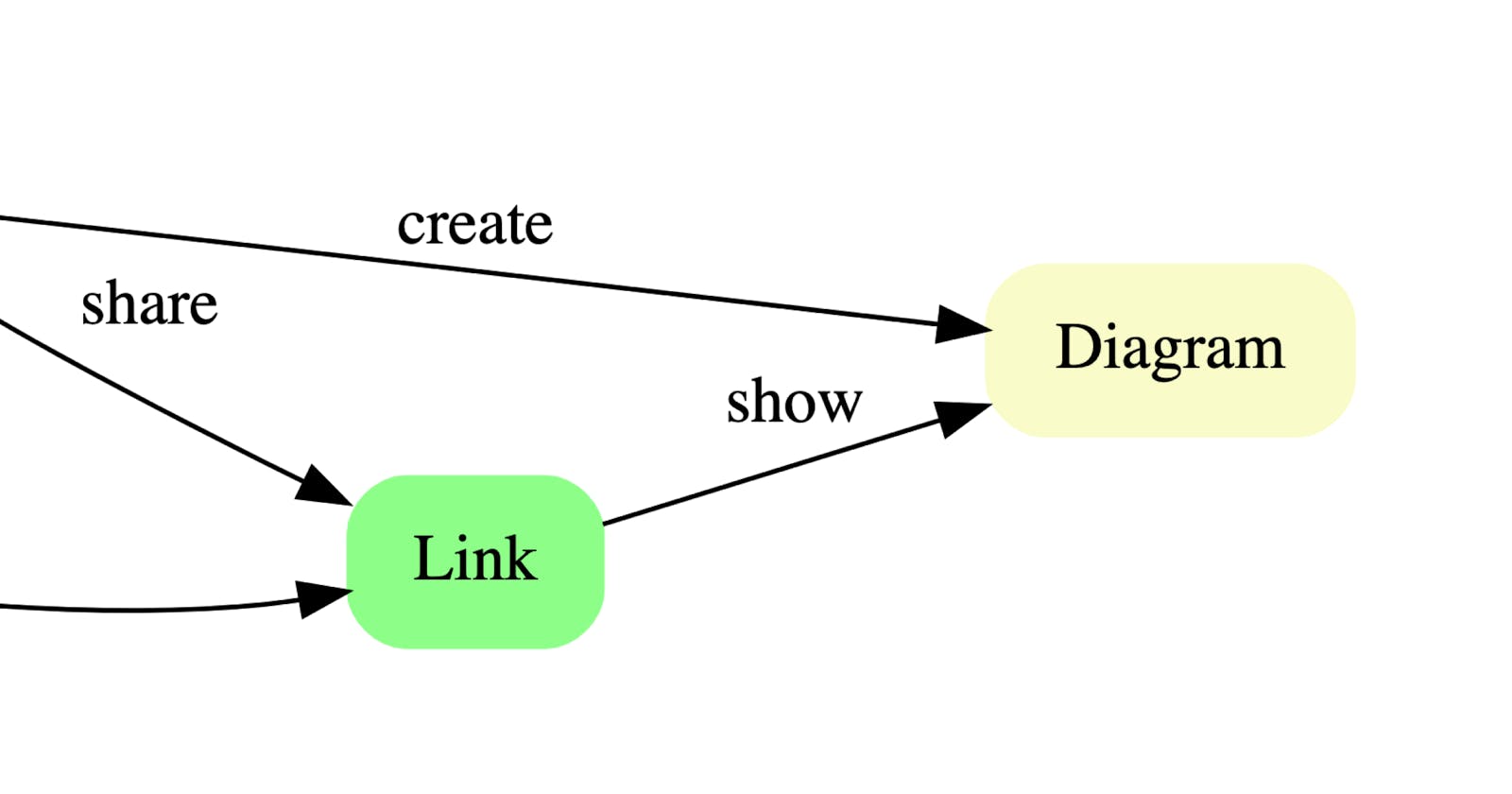
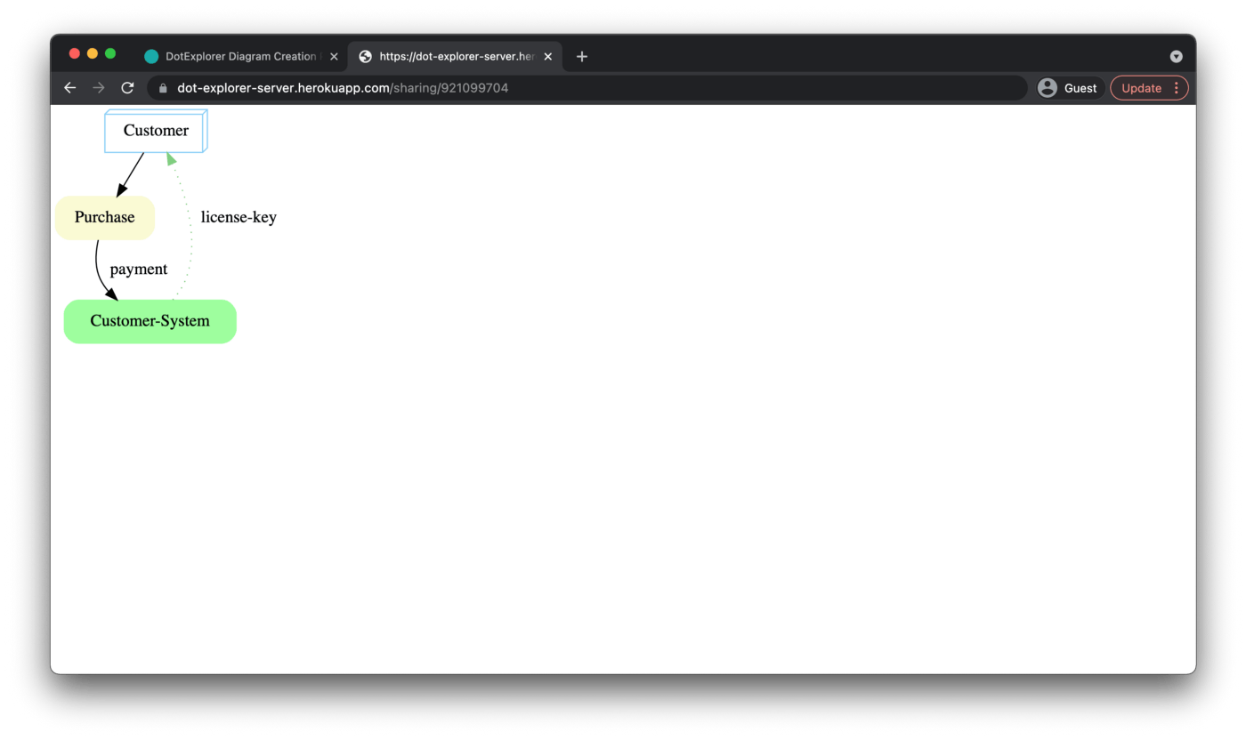
See below an illustration of the sharing mechanism
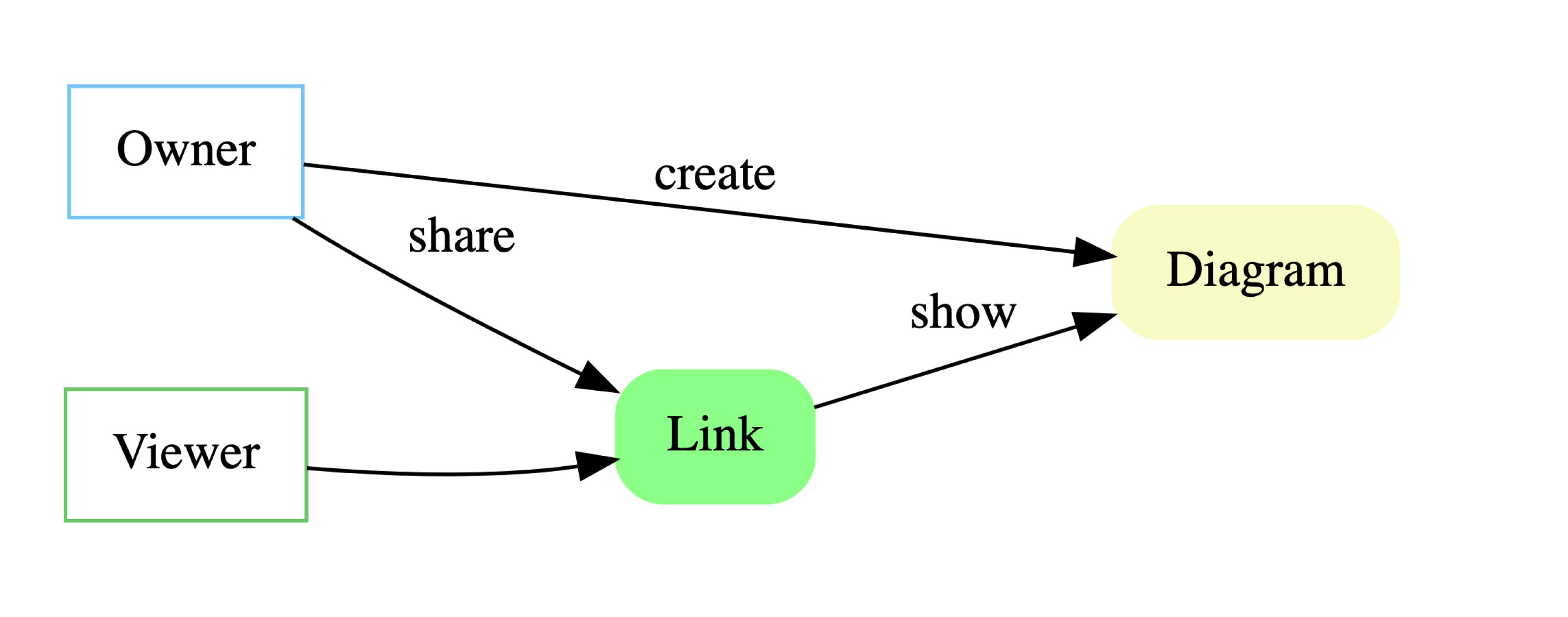 dot-explorer-server.herokuapp.com/sharing/2..
Interaction
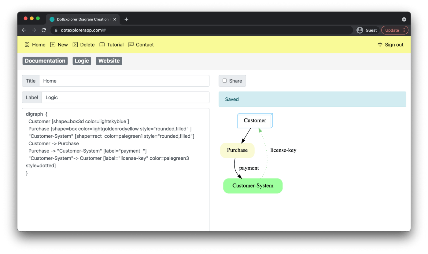
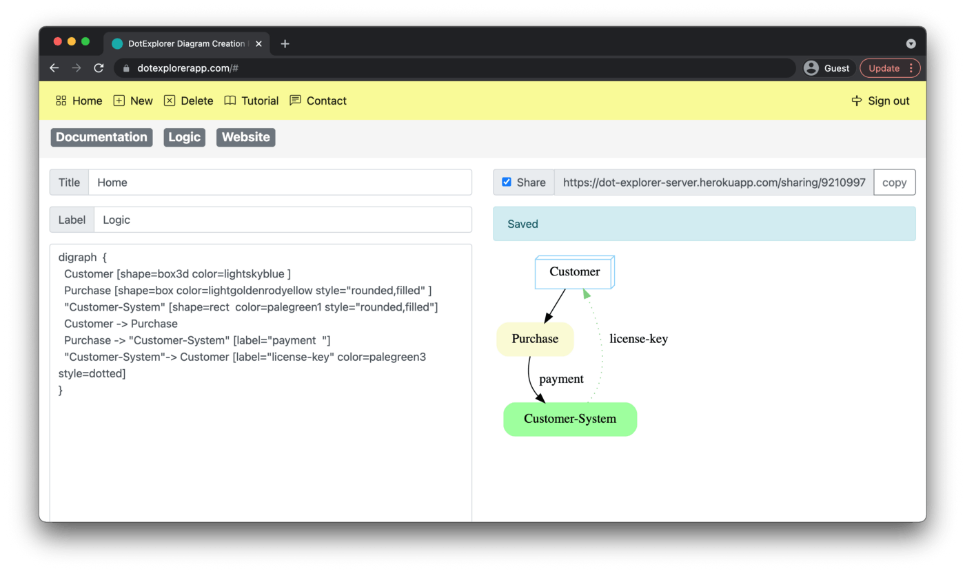
Now let's look at the result and how we have implemented the sharing feature. The three pictures below covers the entire interaction.
- Picture 1) Default behaviour (sharing deactivated)
- Picture 2) Sharing activated
- Picture 3) Shared link to anyone.
Principles
In this section, I would like to highlight the principles considered when designing the sharing feature. All the principles are generic and can be reused when designing other features. The ultimate goal of working with those principles is to create self-explanatory features that can be understood and used by any users.
Wording
This principle can be defined as selecting the minimal number of words to make the feature clear for everyone. In this work, we have selected the word “Share”. Another option considered was “Publish”. In my opinion, an improvement can be made to clarify that when activated, anyone with the link can view the diagram.
Position
This principle can be defined as positioning the feature in the right place on the screen to clarify its objective. In the context of sharing, multiple different features can be implemented, few examples 1) Sharing the diagram visual 2) Sharing the diagram code 3) Giving editor access. The first one will share with anyone a visual representation of a diagram (svg picture) where the other two will allow anyone to see its code or potentially edit the diagram. To clarify this ambiguity, we placed the sharing feature close to the diagram visual representation (can be seen in pictures 1 and 2). As an improvement, we can make it clearer by amending the label from “Share” to “Share (read-only)”.
Widget
This principle can be defined as selecting the right visuals to simplify and clarify the use of the feature. In this work, we had three requirements 1) One-click action to activate sharing 2) When sharing activated, an obvious way for the user to see it. 3) When sharing activated, a simple way to communicate it to anyone. To achieve this, we have combined : a button (to activate / deactivate), a checkbox (to visually display its state) and a text field associated with a button “Copy”. See below the two possible states :
- Sharing widget deactivated

- Sharing widget activated

Efficiency
This principle can be defined as reducing the number of steps required by the user to successfully activate sharing. In this particular example, one click is needed to activate sharing and one click is needed to copy the link. We could potentially reduce this number by automatically copying the link into the user clipboard.
Conclusion
I have written this article to discuss openly with anyone the various ways to design a sharing feature. As you have noticed it in this article, I had a minimalistic approach to the problem by reducing its functionality (e.g. sharing only with everyone on the web) which simplified the required visuals and user interaction. I would be interested to know how you would design it, so feel free to propose other solutions. If you want to play with this sharing feature, it can be accessed here => dotexplorerapp.com , thanks for reading!